Rebuilding our visual identity from the ground up.
Role:
Creative Direction
Design
Implementation
Illustration
It can be hard to justify a rebrand. Abandoning any developed recognition and existing design material can be daunting. But sometimes... that new car smell is exactly what you need.
We needed a fresh start for two reasons.
The world had a swirling controversy over a new social media platform (again) that shared nearly the same name we had been using for years. We had been inundated with confused users, and questioning looks from prospects. It was time to change and avoid the friction.
Our brand was overtly friendly and approachable with characters and pastels. But our core customer persona had evolved into a more sophisticated user, and our relationship to their businesses needed to speak to trust, reliability, and professionalism.
But we didn’t want to be just another corporate brand. We were a playful team, and were building a platform for humans.
The Mark
The collision of two points. The manifestation of turning data relationships into action. A sharp mark of minimal shapes, layered for transparency, and ever pushing forward.
What’s in a Name?
Para- / alongside of, beside
-tive / performs or tends towards action
A name designed to fit into our product ethos of working alongside existing processes and supporting a bias for action. A nonsense word that felt real, with clear positive root word correlations. Parative quickly became a natural and strong name for our team and our customers.
Our Words
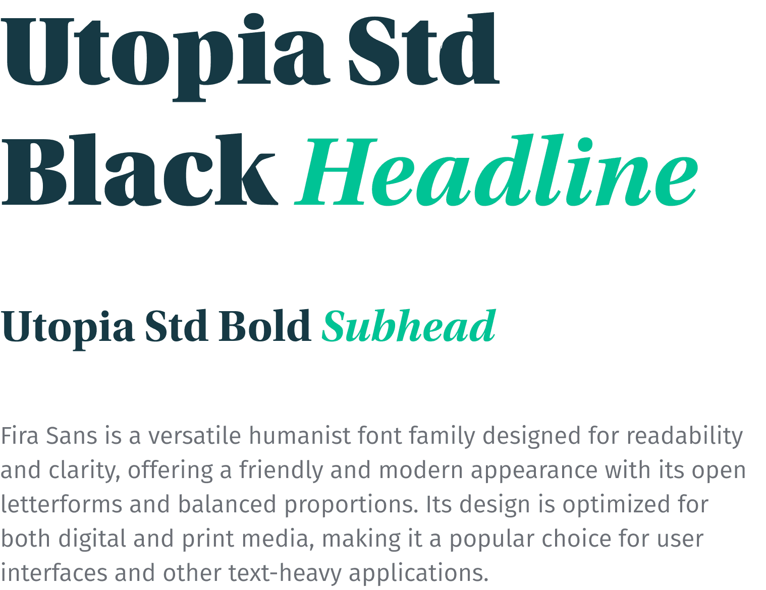
We aimed to make sure we were more than just function. Humanist fonts with traditional forms kept us approachable, yet serious. We chose playful and bright accents to help us punctuate and highlight our core messages. Providing a bit of play to the experience.
What’s in a Name?
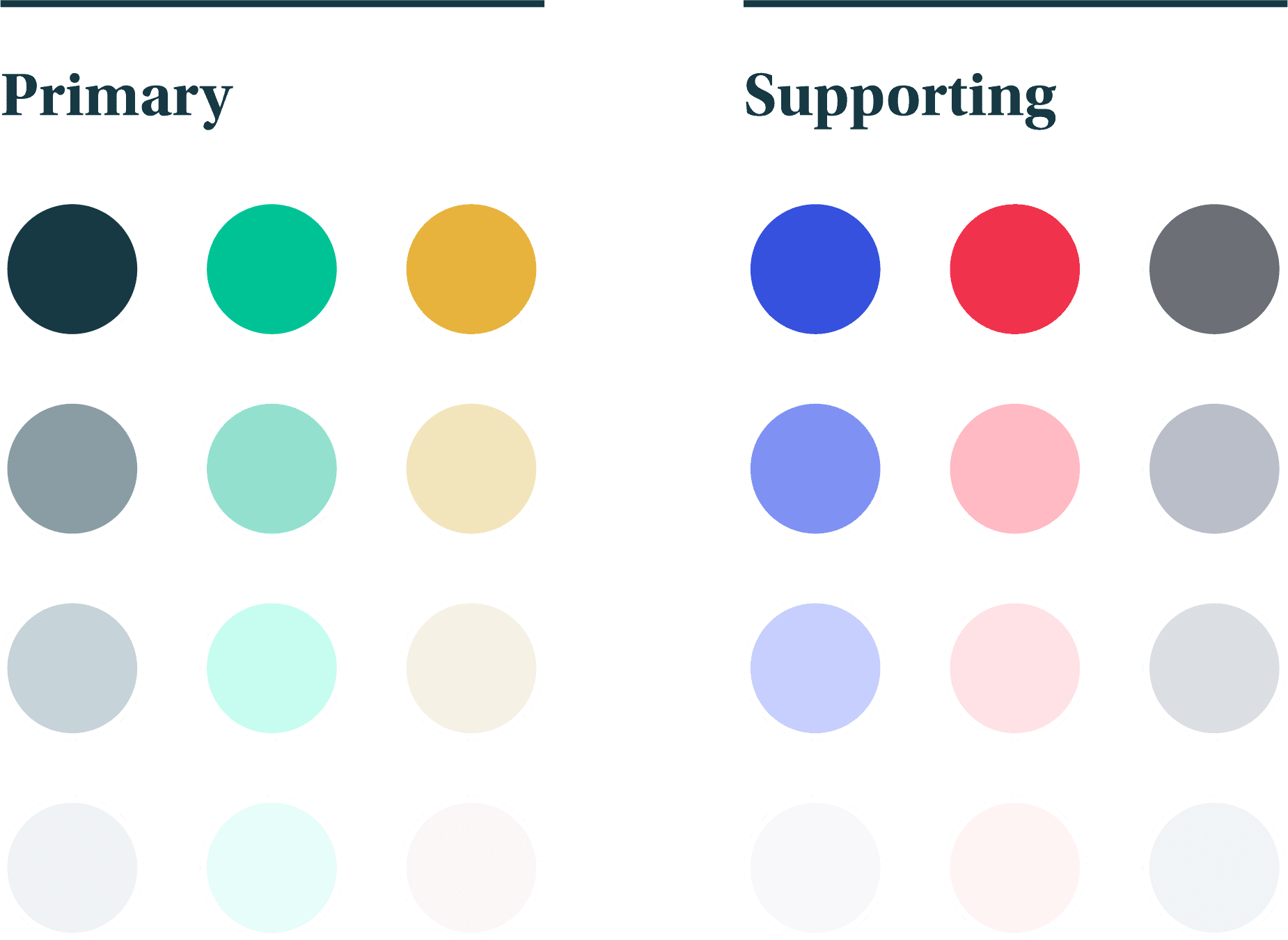
Rich and deep ground colors created a more sophisticated atmosphere than our previous vibrant and pastel hues. A mature base for us to contrast the rest of our brand expression from.
Adding a broad palate of desaturated neutrals created strong contrast to our primary ground colors, allowing us to avoid fields of white in marketing materials, and subtle uses of highlighting in our product experience.
We chose 3 pops for our primary brand accents. All in similar vibrancies that covered the spectrum from modern to more traditional tones.
Last we needed a controlled set of product oriented functional colors. There were certain color needs our product required, being a tool with an ever growing complexity of reports. We where able to piggy back on some of our primary brand colors, but needed to introduce others to better tell product stories.
All of these collected to make a warmer, more inviting experience with our design.
Borrowing From the Past
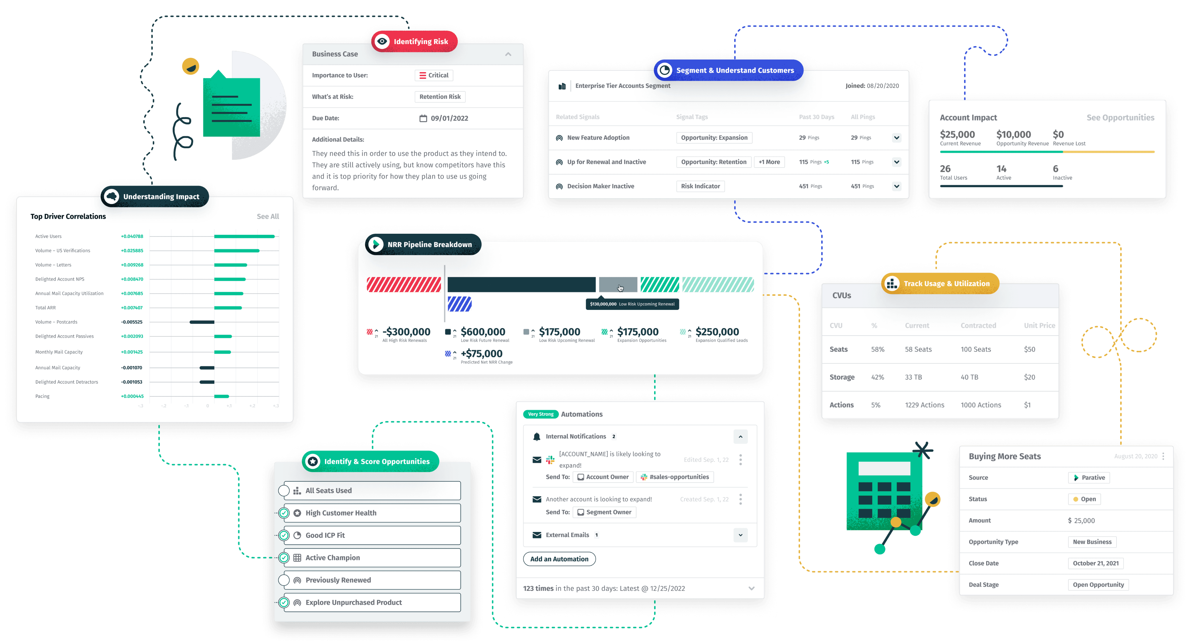
We needed a cohesive style for assisting graphic elements throughout the experience. The focus would be the product, but smaller illustrations and iconography would help translate the purpose of complex UI’s and ground them in familiar visual tropes and purpose.
We looked to mid-century graphic modernism and light constructivists design to pull inspiration for evocative, minimal, and dynamic treatments. We developed two tiers of fidelity depending on how much visual interest and polish was needed. The style also served as a base for attainable motion design. Being a smaller team, the simpler shapes allowed us to make interesting motion assets within reasonable windows of time.
Every new application of a brand is an opportunity to explore its strengths and limitations. Different mediums have unique requirements, necessitating adaptability and room to push the boundaries of our brand system. Our brand needed to demonstrate vitality and passion at every turn.
For the Modern Web
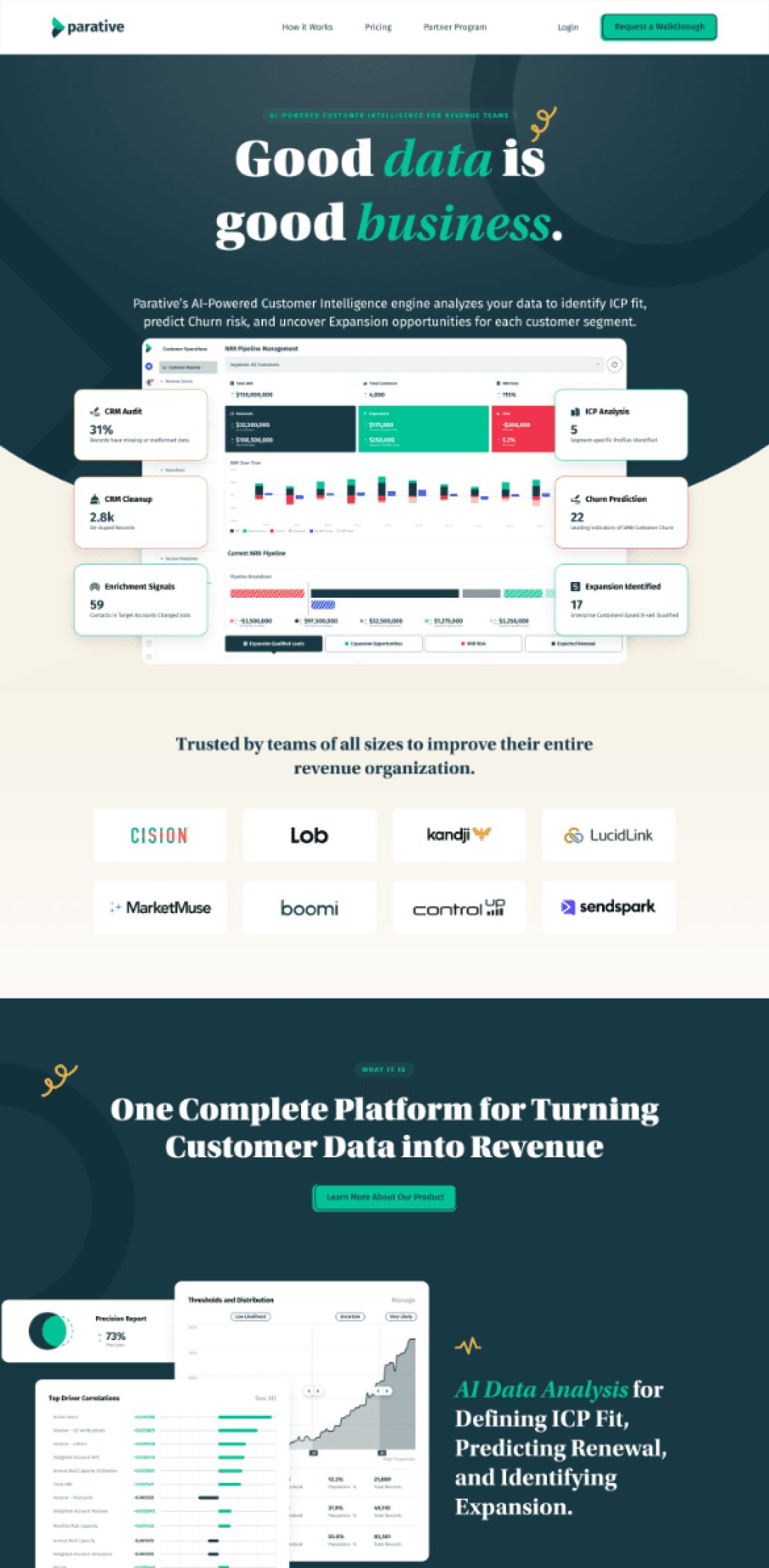
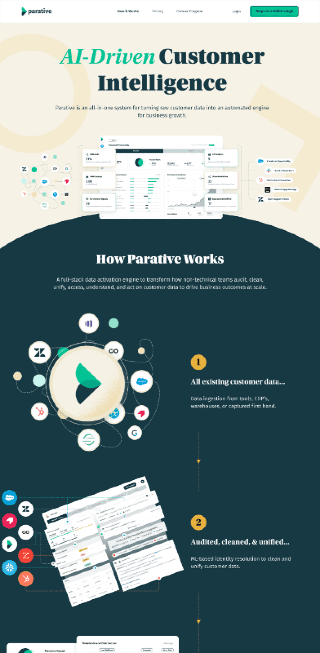
Adaptability was a primary aspect of our web materials. As a young company, we were regularly testing our messaging, which meant that modular layouts that could be quickly swapped were key to our success.
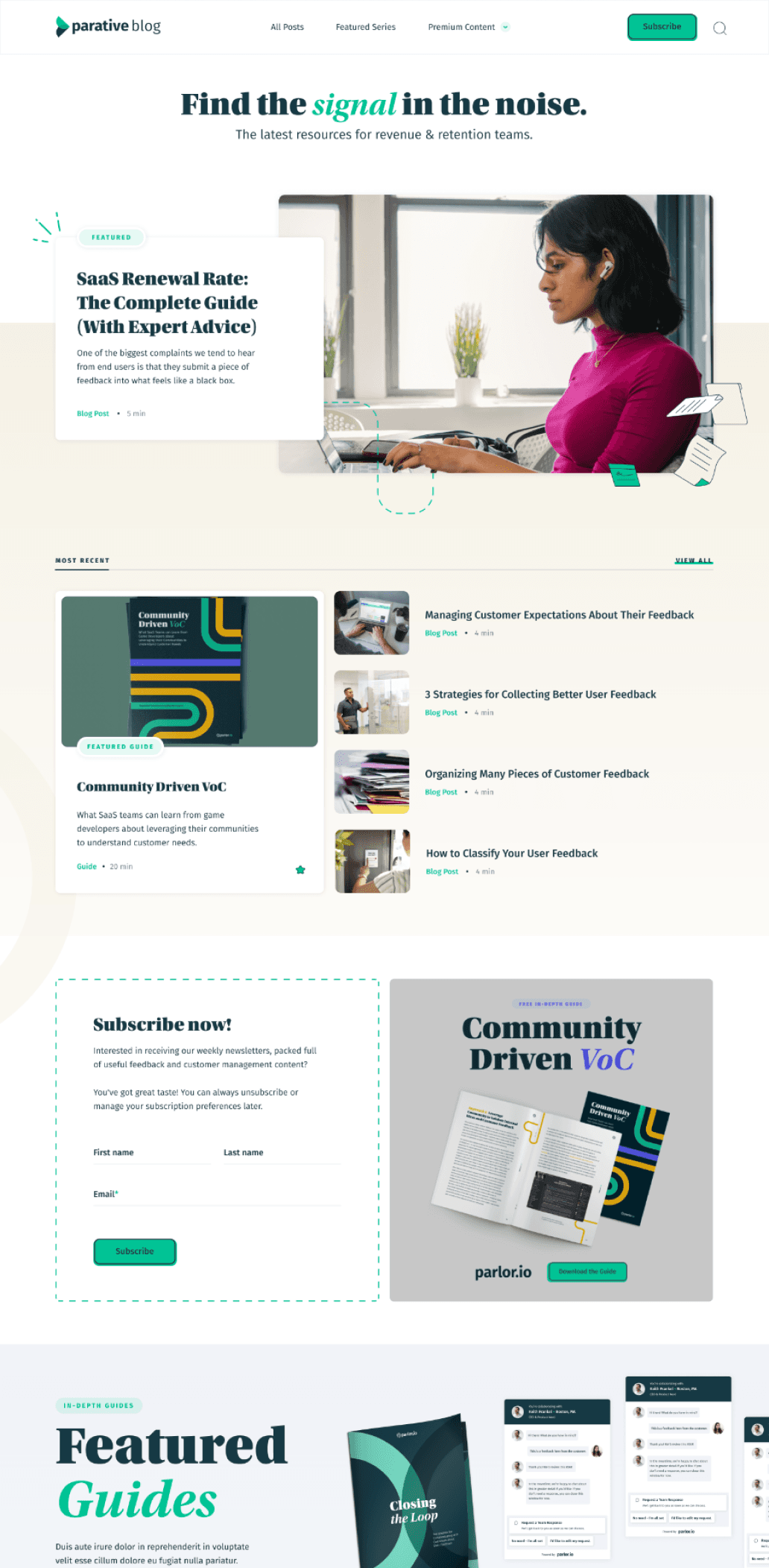
By integrating these concepts, we created a cohesive yet diverse series of templates for our various needs.
Through the use of color shifts and dynamic shapes, we crafted compelling transitions between major content areas and used these elements to introduce new topics seamlessly. The open layout also allowed for the smooth integration of new media, making them feel natural and effortless.
Putting it in Motion
Beyond icon animations, we made an investment in video. Being a remote and small team, we knew we would struggle to get camera video to a caliber and quality we were trying to convey.
Focusing on motion design was a natural fit. It allowed us to tell strong stories at a quicker pace. We were able to utilize our growing aesthetic tools to create punchy and iconic stories that helped sell our mission in meaningful time frames.
Room to Explore
Our brand system being rooted in a design aesthetic that thrived in the era of printed paper, we had a lot of fun applying and exploring aesthetic options.
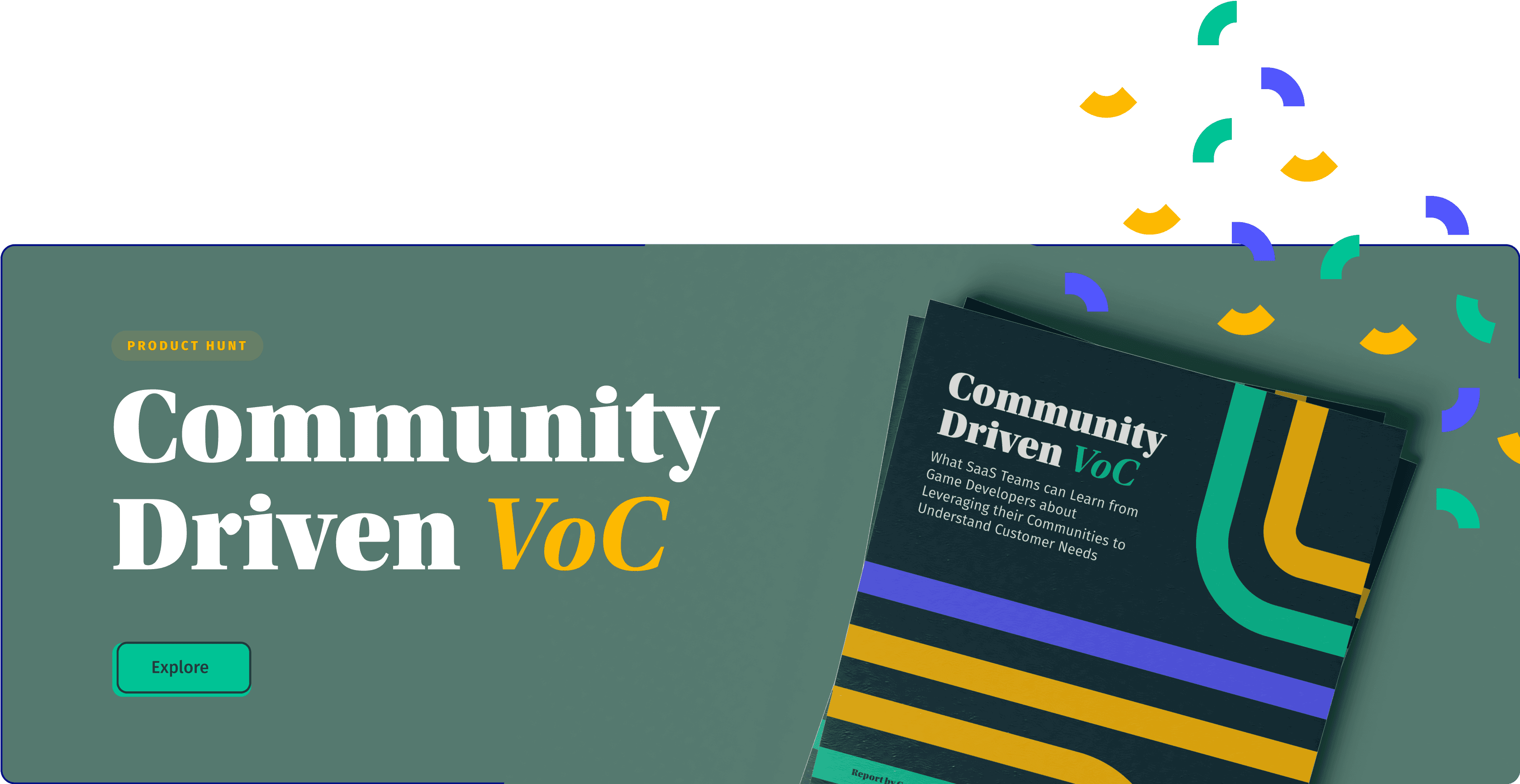
Downloadables and printed assets made excellent opportunities for brand exploration and strong brand statements to make our papers, ebooks, and stationary stand out from colder aesthetic competitors.
